Windows Concept
Hey Windows users, do you think your Windows look the best? If yes, I’d recommend you not to watch this Concept Designer’s ‘Windows Concept’ video. Trust me; it is going to completely ruin your desktop experience by making you realize that the current UI layout of Windows 10 doesn’t look good at all.

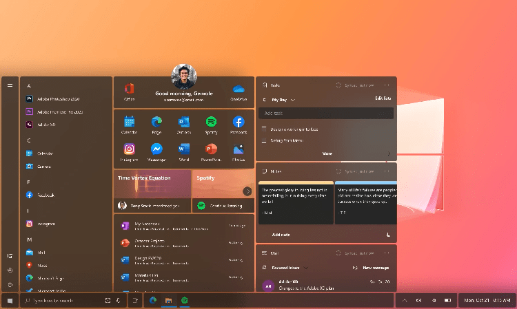
This concept version is well represented in the video and is created by a concept designer June Caspe. Caspe said to that this concept video to be his “personal project” to showcase a “beautiful, user-friendly and intuitive user interface experience for the Windows.” And, guess what he did uphold his sayings in his windows concept design.
The video, as shared on youtube, starts by showing off the different sections in the taskbar, or shall I say taskbar, in his context. June Case has categorized the taskbar by creating small fragmented parts containing the icons and the list of programs very cleverly. So, unlike the current taskbar that is uniformly designed and is followed by a single band at the bottom of the screen. Well, this plan shows that creating different divisions for different categories can give the current taskbar a cleaner look to the OS.
SEE ALSO: Microsoft Teases with New Start Menu
Next, it also showcases the redesigned “Start Menu,” which also carried the “fragmented segment” design. Now, this concept Start menu contains static flat icons of the programs instead of all those dynamic “Live Tiles” of the stock windows start menu. Now, the designer added Lil bit of animations to the Icon blocks like Spotify and a Tony Stark’s messaging application, when hovered by the user, it reveals more information over those icons.
The reimagined windows concept also showed the new “File Explorer” with the minimalistic design. The window carried a translucent picture and looked CLEAN with the dark mode turned on.
Going forward in this video below, it went on to show off the different segments of the taskbar with an in-depth view of the new “Action Center.” Well, the action center also had the same fragmented part look to it. The upper section of the Action center contained all the notification accurately categorized by different apps. At the very top of the Windows Action Center, there are three buttons to show all notification, clear notifications, and also manage the notification settings.
SEE ALSO: Windows Redesigned Action Center
This is one of the best Windows form concepts that I have seen in recent months, and I think June Caspe did an impressive work creating his idea. So guys, what you think about this windows new concept layout? Do let us know your thoughts in the comment section below.


