Facebook New Design
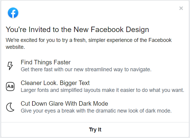
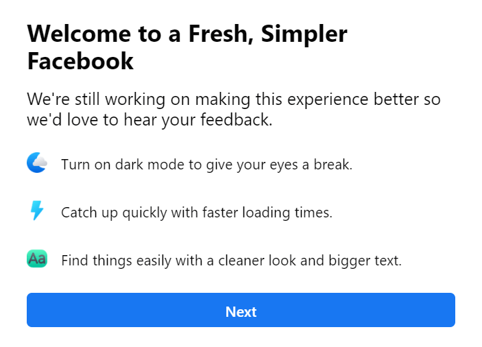
Back on February 8, 2019, Facebook promised a redesign for its mobile application and website. Moreover, the android app started receiving new interface UI designs immediately. However, the change that was only promised on the site in “the next coming months.” But now it has started rolling out to the users and with a new Facebook interface with dark mode option as well.
Of course, the new UI design isn’t globally liked, and it even has lots of issues with the text readability in a few dark mode screens in some of the menu options.
By the way, if you don’t get prompted by Facebook’s website to try out the new Facebook Design UI, there doesn’t seem to be any tricks to trigger the Facebook UI option right now.
Facebook’s New User Interface Design
See Also: Facebook’s Twitter Like UI
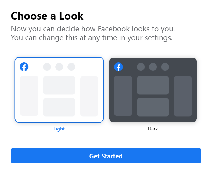
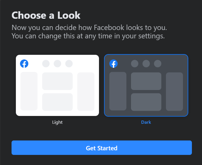
The updated Facebook New Design in their UI rearranges and simplifies Facebook’s some interface, and makes it easier to open Facebook Messanger. And also adds new icons and buttons to its redesigned UI.
If you turned on this new redesign but aren’t feeling the vibe and want to know how to change Facebook interface back to the light theme? Well, you can always switch back to the “classic” Facebook UI quickly. To do so, Tap on the quick settings menu, select “Switch to Classic.” Facebook shows you the way to switch back to classic UI design.
Rolling out Facebook New Design to more users
The very new Facebook site UI with Dark mode seems to be rolling out widely. But it does seem some the users are only getting this new UI to try out pop-ups lately.
If you have already received this new UI design, what you think about it? Do let us know your thoughts in the comment section below.


