Windows Action Center
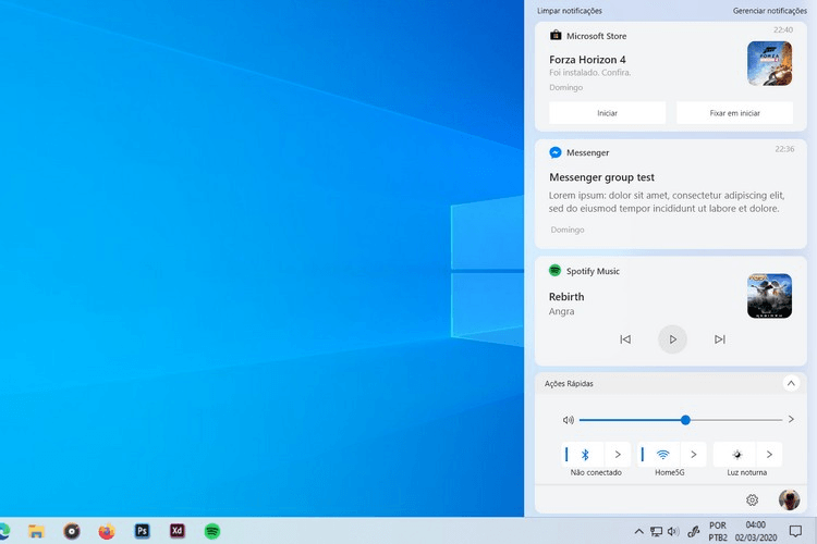
If you are a user of the Windows Operating System, then you are most likely familiar with the Windows “Action Center“. The notification panel settings that slide in from the right side of the screen have loads of quick settings and shortcuts. Although the panel looks clean, it hasn’t got quite any changes in the years. Moreover, Windows Quick Notification Panel has got many updates, but they always keep on lacking changes design-wise. Well, a redesigned Windows 10 Action Center concept by a Redditor, “BrunoAlvesIV” looks much cleaner than the default Action Center.
The Redditor shared his concept in the Windows10 subreddit with all the tweaks and details of the Windows Action Center that may never come with the Windows OS in the coming future. The image shared by the user is provided below.
At the very bottom, the action panel shows some of the quick action buttons like the WiFi, Bluetooth, and Brightness. Apart from all that, there’s also a quick slider for the volume. In the Windows Action Center, there’s Brightness slider which no user will even go for. Moreover, the volume slider makes more sense than the Brightness slider. Just below the quick action options, there’s also settings and profile of the user.
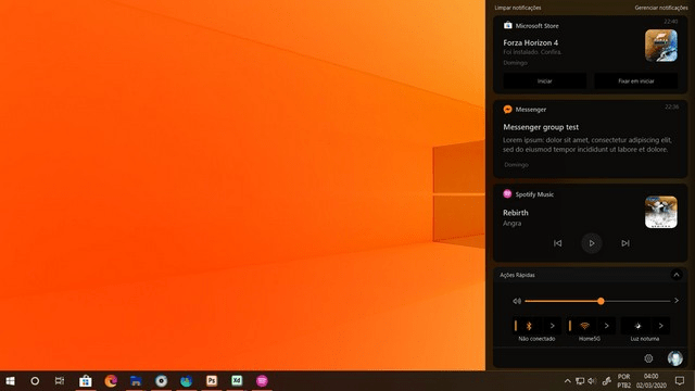
And, one of the users just inverted the color of the image to show how the quick panel settings would look in a dark theme.

It’s not that; I dislike Microsoft default Action Center design. But the concept mentioned above can be used, and whatnot can also be improved with some of the tweaks and design changes.
So, What do you think about the concept mentioned above? Let us know in the comment section below.


